Designing for the Glance
Notes from twelve months designing truck navigation for drivers who won't look at the screen (much).
A forty-tonne truck is running at 80 on a motorway approach and the exit is 400 metres out. The driver looks down at the navigation screen. He has about a second before his eyes have to be back on the road. It's the road that sets that limit, not us, and the whole design problem is what we manage to do inside it.
The design work started twelve months ago, from nothing, and with more engineers than the project has now. For most of the build the team has been one product owner, one senior Android engineer, an engineering manager, and me as the only designer on it. What we've been building is a navigation module inside a fleet management platform that transport and logistics operators use to run missions, trailers and drivers across fleets of twenty to several thousand vehicles.
The cab sets the terms before any of us do: noise, vibration, a screen read at a fixed distance, often in direct sunlight, sometimes with gloves on, by someone legally required to keep their attention on the road. Every decision below is downstream of that.
The app exists because truck drivers are served badly at both ends of the market. Google Maps and Waze are free, accurate, excellent at last-mile detail, and structurally incapable of accounting for a vehicle's height, weight, axle load or dangerous-goods class. Dedicated truck navigation handles all of that and costs money, €70 to €100 a year per device by drivers' own accounts. Independents pay it themselves. The employed mostly don't, and fall back on the consumer app in their pocket, because whatever the operator installed doesn't do the job they actually have.
Those drivers aren't our customers, though. The buyer is the transport operator, and what the operator buys is the platform. Navigation comes inside it at no extra cost, and that's the leverage: against a dedicated device it costs the operator nothing more, and against the free app already in the driver's pocket, it knows what the truck is.
It's worth being straight about why the module got funded, because it wasn't the driver's story. The platforms we compete with already sell navigation as one module among several, next to fleet management, dispatch, warehouse and driver workflow, and an operator comparing platforms counts what's in the box. So the brief wasn't to invent anything: it was to reach parity with the most entrenched products on the market, and then to hold our own against them. The driver's problem is what made it worth building well. The commercial pressure is what made it get built at all, and those are two different things.
How we decided what goes on the screen
I didn't start with principles. I recognised them afterwards, rereading twelve months of decisions and noticing that they were all answering the same question: what can a driver take in with one look, and what does everything else cost?
Three came out of it, and none is a stylistic preference. They're what the context imposes.
Subtraction, as a product decision before an interface one. We scoped the application by asking what carries value against the use cases we actually know, and removing the rest. Then the same question one level down, and again below that: which flows exist, which steps a flow contains, which elements a step displays, how many tokens the system needs. A feature that survives that question earns a screen. An element that survives it earns pixels.
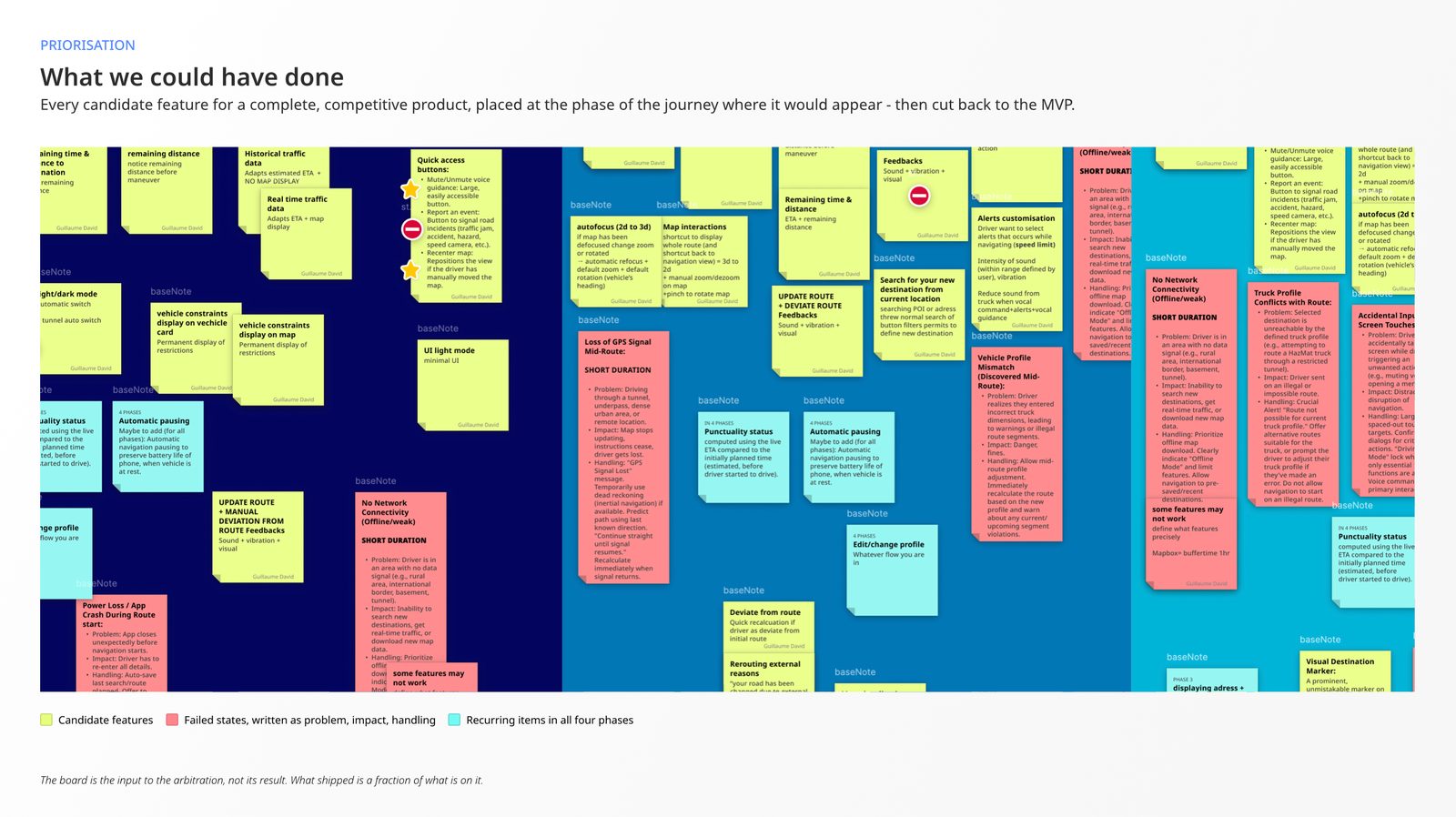
Contextual design. Show what is useful at the point the driver has reached in the journey, rather than making everything permanently available. The reason we hold to it is cognitive load at the critical moments: not minimal load everywhere, but minimal load precisely where a mistake is expensive. Some screens can afford density. A guidance banner two hundred metres before an exit can't.
Function over form, when the two conflict. Form loses. There's an example further down that looks, written out, like a regression.
And one sentence, not an original one, that I've said on this project more than any other: just because we can doesn't mean we should. The routing engine produces far more data than a driver can use. The platform can render more states than a driver can distinguish. The pull towards surfacing capability is constant, and resisting it is most of the job.
That pull has a name. Across eight experiments, Adams, Converse, Hales and Klotz found that people given a problem reliably add components rather than remove them, even where removing is the better answer, and that subtractive solutions only surface when something prompts them.[1] Adding isn't a failure of discipline. It's the default, and it stays the default unless a rule drags the alternative into the room. Which is why repeating a worn sentence out loud, in meetings, is worth more than it sounds.
What follows is that question applied at every scale, from the guidance banner down to the rounding of a number. The truck makes the reasoning visible: when the attention budget is a fraction of a second and the cost of being wrong is physical, you have to say out loud why every element earns its place. Every product has that budget. Most of the time, nobody makes you show your working.
What a glance costs
The number everyone in this field works from is two seconds, and it's worth knowing where it comes from. In the 100-Car Naturalistic Driving Study, glances away from the forward roadway totalling more than two seconds increased near-crash and crash risk by at least a factor of two, while short glances did not. Brief scanning of the driving environment came out as safe, and in some conditions protective.[2] NHTSA turned that into an acceptance criterion for in-vehicle devices: tasks should be completable with glances of two seconds or less, with 85 % of glance durations under that bar and no more than twelve seconds of eyes-off-road in total.[3]
That 85 % is the part worth reading twice, because it's a statement about a distribution rather than a mean. A design that produces an average glance of two seconds puts a very large share of real glances above the threshold where risk doubles. Two seconds is where things start going wrong. It's not where you aim.
Our working target was under a second. That figure is a design choice rather than a published one, and it exists to leave room for the tail: the tired driver, the sun on the display, the banner that changes in the middle of a glance. It turns out to sit almost exactly on what drivers already do: NHTSA's instrumented study of visual-manual secondary tasks measured a mean glance duration of 0.97 seconds.[4] We didn't derive the target from that figure. But designing to one second means designing to the glance a driver already takes, rather than to one he'd have to learn.
Which forces ranking, before anything gets drawn. You decide what is read first, second, third, and you accept that whatever falls below the line may not get read at all.
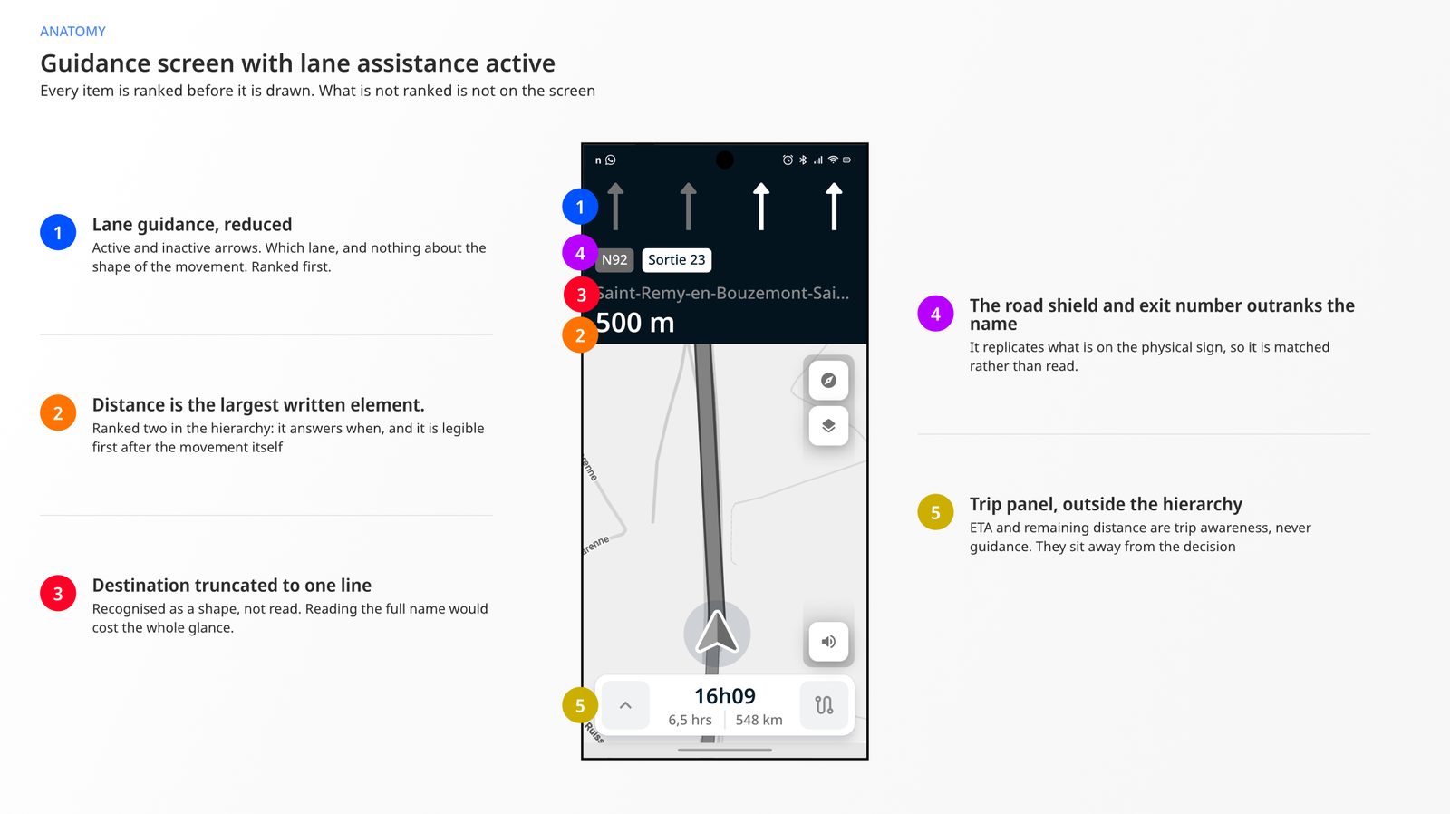
Ours came out as: the manoeuvre icon, then the distance to it, then the road shield, then the place name, then the secondary banner for what comes after. The trip information panel (remaining time, remaining kilometres, ETA) sits outside the guidance hierarchy entirely. It's for the driver who has already decided he has a moment.
One rule fell out of that and then governed every string in the product: the icon and the text must never say the same thing. The icon carries the movement. The text carries the target.
A word on what you're looking at. The application isn't released, so nothing here is the shipped build. The screens below are my own specification renders, and the product will not look exactly like them.
Removing the verbs
Guidance text isn't written, it's composed. The line the driver reads is assembled from routing data (manoeuvre type, road number, exit number, target), and the design decision is which of those fields make it into the string, in what order, and which ones get dropped on the way.
We drop the verb phrase entirely.
| Situation | We show | We don't show |
|---|---|---|
| Simple turn | Route de Quimper |
Turn right on Route de Quimper |
| Motorway exit | Exit 23 → Vannes |
Take exit 23 → Vannes |
| Fork | A6b → Lyon |
Keep left towards A6b → Lyon |
| Same road continues | A10 |
Continue straight on A10 |
Every string on the left is shorter than its neighbour by a verb and a preposition, and the argument for cutting them is spatial rather than editorial. The removed words are the words the eye travels across before it reaches the one that matters. Turn right on occupies the first third of the line, and the driver already knows he's turning right, because there's an arrow above it pointing right.
Because it's a composition rule and not a set of strings, it holds for every instruction the app will ever generate, including the ones nobody on the team has seen, on roads none of us will ever drive.
Removing the place name
I had to argue this one, so it's worth reconstructing the argument.
A guidance banner carries a road number, A14, and a place name, Saint-Remy-en-Bouzemont-Saint-Genest-et-Isson. Neither of them is the trip's final destination. They're what the next manoeuvre leads to: the same pair the driver is about to read off the gantry sign hanging over the carriageway. Convention gives the place name the weight, because it's the human-readable half. We inverted it. The road shield takes priority, the place name truncates to a single line, Saint-Remy-en-Bouzemont-Sai…, and it never wraps.
Written into a specification, that looks like a regression. You are deliberately showing less of the thing the driver is looking for. This is where function over form stops being a slogan and costs something.
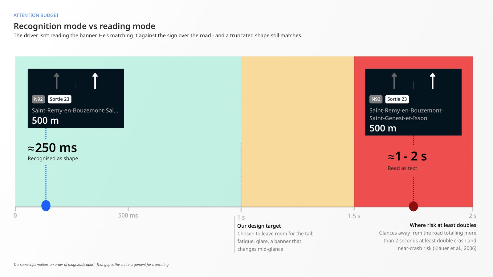
The argument starts with what the driver is actually doing in that second. He isn't reading the banner. He's matching it against the sign over the road, comparing two objects to see whether they agree. That's a shape comparison, and a truncated shape still matches.
Saint-Remy-en-Bouzemont-Sai… sitting next to A14 works as a print rather than a phrase: a word shape, a length, a colour, a rectangle in a position the driver already knows.
The cost of the alternative can be worked out rather than asserted. Reading isn't continuous. The eye moves in saccades and stops in fixations, and in silent reading a fixation lasts roughly 200 to 300 milliseconds while each saccade advances seven to nine character spaces.[5]
Saint-Remy-en-Bouzemont-Saint-Genest-et-Isson is forty-five characters. That is five or six fixations: over a second of eyes off the road, and close to two at the slower end, before the eye has finished a string it never needed in full.
The truncated form takes one. One fixation against five or six is the whole argument, and it's arithmetic rather than preference. It also puts the full name exactly on the threshold where the risk data stops being comfortable.
So: one line, truncated, shield first.
A word about where the numbers underneath came from.
Not from ISO, in this case. ISO 15008 specifies visual presentation in vehicles, and it explicitly excludes heavy vehicles from its contrast and character-size clauses, because those clauses lean on a passenger-car standard.[6] Nothing equivalent is written for a truck cab. So the values came from the automotive design systems that do publish concrete figures: Google's Design for Driving, which sets primary text at 32 dp, secondary at 24 dp, a contrast ratio of at least 4.5:1 and touch targets no smaller than 76 × 76 dp[7], and Apple's CarPlay guidelines[8]. The ISO standards were used where they do apply and do say something usable.[6] [9]
Both of those are written for passenger cars. We took them anyway, because a cab is the same problem: a screen at a fixed distance, a driver who can't look at it, an environment that punishes small type. And there's a tempting argument that a truck buys you slack, since it moves more slowly than the car those guidelines assume.
I'd hold that one loosely. A loaded forty-tonne truck needs a great deal more distance to stop than a car at the same speed, so lower speed moves the risk from reaction time to stopping distance rather than removing it. The honest version is that we borrowed a passenger-car reference because no truck reference exists, we think the borrow is safe, and we haven't proved it.
Even unproven, the borrow is worth more than the alternative: a published number can be named, checked and argued with, and taste can't.
Removing the lane nuance
This is where just because we can doesn't mean we should stops being a workshop line and costs us a feature.
The routing engine can distinguish nine lane manoeuvres: continue straight, then slight left, left, sharp left and merge into the left lane, and the same four mirrored on the right. All of it was available. Displaying it would have been defensible. It's more information, and it's accurate.
The driver is asking one question. Which lane do I need to be in? A row of arrows with some of them active answers that question completely. Adding the shape of the manoeuvre to each arrow adds states he has to parse before he can extract the same single fact.
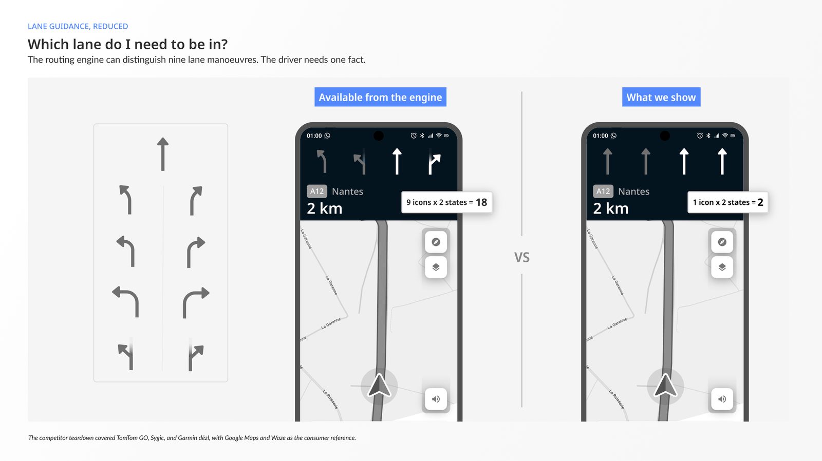
What settled it came out of the teardown. We had gone through TomTom GO, Sygic and Garmin dēzl, with Google Maps and Waze as the reference for what drivers are already fluent in. Most of them show manoeuvre shape alongside lane occupancy, on the reasonable assumption that more information helps. One had gone the other way: Waze had walked back from a more detailed lane display it had previously shipped.
That direction is the entire signal. A team with research resources far beyond anything available to us removed information after having shipped it. Restraint before shipping can be a preference. Removal after shipping is a finding.
Removing the precision
The last removal is the smallest, and it reads like a rounding error until you see the rule.
The distance to the next manoeuvre is rounded and refreshed by band. Under 30 metres it reads 10, 20, 30, refreshed every 10 metres, because that is where the number drives the movement itself. Between 200 metres and a kilometre it rounds to the nearest 50. Past 20 kilometres it rounds to the kilometre. And when the routing SDK can't produce a distance at all, the banner shows a dash rather than a guess.
| Real distance | Displayed | Refresh | Why |
|---|---|---|---|
| 0 to 30 m | 10 / 20 / 30 m |
10 m | the number drives the manoeuvre itself |
| 30 to 80 m | 50 / 70 m |
10 m | urban approach, low jitter |
| 80 to 200 m | 150 / 200 m |
50 m | limits jitter while closing in |
| 200 m to 1 km | 750 / 900 m |
50 m | typical motorway approach |
| 1 to 5 km | 3.2 km |
100 m | balanced precision |
| 5 to 20 km | 12.5 km |
500 m | long motorway segment |
| over 20 km | 46 km |
1 km | nothing finer decides anything |
| unavailable | – |
fail-safe when the SDK drops |
The engine can do far better than any of those bands, at whatever refresh rate we ask of it. Displaying that would hand the driver a number that changes constantly and never changes what he does. Precision below the threshold where a decision changes stops being information and becomes motion in the corner of the eye, and motion in a guidance banner is the expensive kind: it recruits attention that had somewhere else to be.
How we tested without drivers
None of this has been in front of a truck driver yet, and I'd rather say so early. Part of that is timing: the product ships in a few weeks. The rest is structural: drivers are on the road all day, and the ones we did reach described the same wall, that on a break they're legally off duty and have no appetite for talking about work. A panel would have cost more than the project could carry at that point.
So the work went into what you can test with instead, and no single instrument carries it.
Secondary research came first, handled with the seriousness usually kept for primary. Interview snapshots from the drivers who were reachable, mined for verbatim rather than for volume. A structured teardown of TomTom GO, Sygic and Garmin dēzl. Engineering Q&A kept as a living document, so that design decisions and platform capability stayed in the same place. A terminology glossary, because three teams were using "manoeuvre", "route", "guidance" and "deviation" to mean four things each.
Then the instruments inside the product. Events chosen before the flows were built, so that behaviour could be counted and timed rather than assumed. That one has a section of its own below. An in-house test team running sessions against that instrumentation, rather than against a build with nothing in it. We don't write their protocol, which limits what a pass or a fail from them actually tells us.
And a screenshot control built into the navigation interface: shutter sound, thumbnail confirmation in the corner, and a capture that carries the matching log with it, so a tester can report a problem with its full technical context already attached, in one gesture. Designing for the people who have to find the defects is part of shipping, and it's the kind of thing a team only builds when design and engineering are already in the same conversation.
And the road, which the product owner has covered more of than anyone. The protocol is two phones, one in the driver's position and one with a passenger taking notes as it happens, screen recordings running on both, and the two logs read against each other afterwards. It's a small vehicle rather than a cab, and it's us rather than a driver, so it doesn't answer the question at the top of this section. What it catches is everything that only misbehaves on a real road: an instruction announced at the wrong moment, a name that arrives too late to be read, a route that doesn't behave the way the simulation drew it.
Then simulation, which is where the timing decisions actually got made: camera transitions run 300 to 500 milliseconds in town and 500 to 700 at speed, and no specification settles that. We watched it run, at different speeds, and then watched it again to check whether the eye could still find the distance while the camera was moving.
It's the instrument we lean on hardest for the parts of the interface that only exist in motion: camera behaviour, manoeuvres, lane assistance. It's also the easiest one to be fooled by. Rendering it is expensive, and under certain conditions the frame rate drops, so some of what you're watching is a defect of the rig rather than of the product. Telling those apart is part of using it, and it's why no instrument here is worth much on its own. Between them they settle what can be settled without a driver: that the interface behaves as specified when it's moving, that the composition rules hold on roads nobody has driven, and that defects surface with their context attached.
What would tell us we're wrong
There's one more decision underneath all of those, and it happened before any of them.
Before these screens existed, we chose which events the app would emit and what each one was meant to track. What I never wrote down was the result that would prove us wrong. I don't configure the analytics platform; engineering does that. Choosing which events are worth capturing is a design decision, and it's the one that gets skipped, usually until after go-live, when the first months of real use produce experience that nobody can measure.
For the truncation, that gives us something to be wrong about:
We believe truncating the place name and ranking the shield above it keeps the glance under a second. We would know we were wrong if drivers started reaching for the full name during guidance, because that would mean recognition is failing and they've fallen back to reading.
Here's the uncomfortable part. We can't run that test today. Nothing in the app emits an event that would catch it, and there's no field data to compare against, so the decision is reversible on argument rather than on evidence, which is a much weaker thing.
I didn't find that gap by auditing anything. I found it by trying to write the sentence. We measure a great deal, and I had never once written down in advance what I expected the numbers to show. In advance is the whole difference: written before, it's a prediction that can fail; written after, it's a justification wearing the same clothes. That holds at four people who talk all day. It stops holding the moment the team grows, or the moment someone asks in a year why the place name is truncated and the only answer left in the repo is that it always has been.
So this is the first one, and I wrote it after the decision rather than before it, which makes it a justification, by my own definition.
The gap is narrower than it sounds, though. The app goes live with a broad set of tracked events already in place, and catching this particular failure means extending that instrumentation, not inventing it. What events can't give us is the reason behind a number, so the next layer we're considering is qualitative feedback collected inside the app itself, rather than on a driver's break. None of that replaces sitting next to a driver. It gets closer than anything we've had so far, and it's the kind of thing we can keep adding to as the product lives.
The first months of real use will bring plenty of evidence. We'll make sense of it.